היבטים מעשיים בבחירת צבע מצע צבעוני לציור באיטליה במאה ה-16.
- Shlomi Haggai

- 14 ביולי 2023
- זמן קריאה 6 דקות
לא פעם אני נשאל על צבע מצע הציור. האם לצייר על בד/ עץ צבוע בלבן או בצבע אחר? אני תמיד עונה שאין תשובה אחת ושזה תלוי באפקט שהאמן רוצה לייצר. לאורך ההיסטוריה תאם צבע מצע הציור לתקופה/ למקום ולעיתים גם לצורך. כך, למשל, צבע מצע הציור הפלמי\הולנדי של המאה ה־15 היה לרוב לבן (כפי שניתן לראות בפרט מהציור המצורף) וצבע מצע הציור ההולנדי במאה ה־17 היה אפור (בהיר או כהה), חום ולעיתים אף חום אדמדם.
קראתי לאחרונה מאמר מרתק שמנסה לבחון היבטים מעשיים בבחירת מצע הציור באיטליה במאה ה־16.[1] המאמר התחבר לטקסטים שקראתי ב״מדריכי ציור״ מתקופות שונות.

Studio of Dieric Bouts the Elder, saint luke Drawing the Virgin 1440-45 oil on canvas transferred to panel,
109 x86.5 cm The Bowes museum, Barnard castle.
1. הובלה – ג'ורג'יו ואסארי[2] כתב שציור על בד מאפשר העברה ממקום למקום כיוון שאפשר לגלגל את הבד. עם זאת, ואסארי הוסיף שכדי לשמור על גמישות הבד ושלמותו אין למרוח עליו ג׳סו, מפני שהוא עלול לגרום לשכבת הבסיס להיסדק עם גלגול הבד.
In order to be able to convey pictures from one place to another, men have invented the convenient method of painting on canvas, which is of little weight, and when rolled up is easy to transport. Unless these canvases intended for oil painting are to remain stationary, they are not covered with gesso, which would interfere with their flexibility, seeing that the gesso would crack if they were rolled up[3].
המשורר והמחזאי הפלורנטיני רפאלו בורגיני[4] כתב בספרו Il Riposo[5] על הכנת הבד לציור בצבעי שמן. הוא הסביר כי יש למרוח שכבה ראשונה של דבק כדי לסתום את חורי הבד ושכבה שנייה של צבע, וכך אפשר לגלגל את הבדים ולהעבירם ממקום למקום. בפסקה אחרת התייחס בורגיני להכנת הבד עם שכבת גיר וציין כי הכנה מעין זו מקשה על גלגול הבד כיוון שהיא גורמת לשכבת הגיר להיסדק.
But if you want to paint on canvas, there you will apply a coat or two of size and then begin colouring. And fill in the texture of the cloth well with the color. And the Flemish canvases, which can easily be rolled up and carried everywhere, are done in this way[6]
The first way is to apply one layer of size and then two of priming, leaving each layer to dry. For the second way, take some Volterrano chalk and some of the superfine flour called fucello, in equal parts. These materials, put in a little pot with glue and linseed oil and brought to a boil, are united together. And then this mixture is put on the canvas and flattened and spread out over everything with an iron rod. And when it is dry you paint on it. But the first way is better if the canvas has to be transported to other countries. Canvases done in the second way, with chalk, would crack in many places in being rolled up[7].
2. יעילות ואפקט חזותי – ציור של דמות בהירה על בד צבוע (שאינו לבן) יגרום לדימוי להיראות ברור ומיידי. לכן ואסארי הציע לצייר להתחיל ברישום על המצע הצבעוני בגיר חייטים לפני ציור בצבע.
He who does not wish to make cartoons should draw with tailors chalk over the priming or with a charcoal made from the willow tree, because both are easily erased[8]
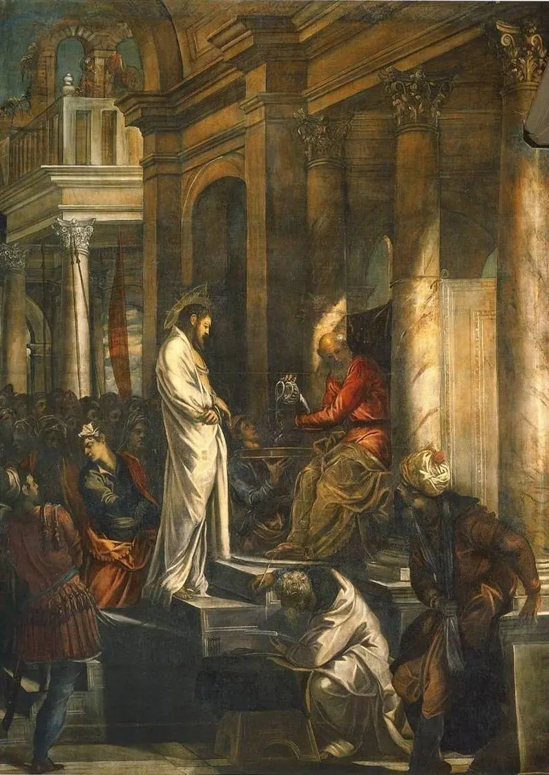


Tintoretto 1518 - 1594 Christ before pilate 515 X 380 oil on canvas Scuola Grande Di San Rocco, Venice.
Marie-Victoire Lemoine French, 1754–1820 Atelier of a Painter, Probably Madame Vigée Le Brun (1755– 1842), and Her Pupil. Oil on canvas 116.5 x 88.9 cm.
האפקט החזותי של רקע כהה ודימוי בהיר נכון עוד יותר כאשר מדובר בציור גדול ממדים שיש לראותו מרחוק. ואסארי כותב על כך בהתייחסות לציור המחקה אלמנטים דקורטיביים.
The high lights are put in with pure white, and the strongest shadows are
finished with the deepest black. such work must have boldness, intention,
power, vivacity, and grace, and must be expressed with an artistic freedom
and spirit and with nothing cramped about them, because they have to be
seen from a distance.[9]
3. אופטיקה – לימוד הידע על האופטיקה של הצבע היה חלק מהותי בהכשרת האמן. ציירים עשו שימוש אופטי בשכבות הציור ובשקיפות של צבע כדי לתרגם את המציאות על מצע הציור.אחת מהדוגמאות החשובות לשימוש בצבע תחתון אזורי היא השימוש בירוק כצבע תחתון בפניהם של דמויות – הירוק כצבע תחתון ומעליו צבע גוף ״מזקין״ מעט את הדמות. צנינו צניני[10]בספר ההדרכה שלו מתחילת המאה ה־15 ציין את החשיבות של צבע ירוק תחתון מתחת לגוף חשוף.
How to paint faces
When you have done and painted clothes, trees ,buildings and mountains
you need to move on to painting the faces, for which you need to
begin with this method: get a little green earth with a little thoroughly
bound lead white and apply it two layers all over the face, over the
hands and over the feet and over the naked parts [11]


Duccio 1255- 1319 Detail, Maesta 1308-1311, Tempra on wood ,214 x 412 cm. Siena
Michelangelo 1475 – 1564 Madonna and Child with St John and Angels 1497 Tempra on panel
105 X 76 cm National Gallery London.
חשוב לציין כי צנינו היה שוליה בסדנה של אגנולו גאדי,[12] שהיה שוליה של אביו תדיאו גאדי,[13] שהיה שוליה של ג׳וטו. כלומר הטקסט שכתב צנינו מאגד ככל הנראה ידע מוקדם עוד מימיו של ג׳וטו.[14]
לצבע הטמפרה יש נטייה להיעשות שקוף עם השנים, ולכן בציורים רבים אפשר לראות את השכבה התחתונה.
ליאונרדו דה וינצ'י תיאר בכתביו על ציור את השימוש בצבע שקוף מעל צבע אחר. צבעו של העשן היוצא מן הארובה משתנה לפי הצבע הנמצא ברקע. כאשר הארובה נמצאת ברקע צבע העשן כחול, וכאשר השמיים הם הרקע צבע העשן משתנה לאפור או אפור סגלגל.
When a transparent color is placed on another color, it becomes changed by it, there is composed a mixed color, different from both the simple ones that com- pose it. This is seen in smoke coming out of chimneys which, when it is in contrast to the black of the chimney , appears blue; and when it rises, in contrast with the blue of the air, it appears grey or reddish. So also scarlet laid upon blue makes violet, and when blue is put on yellow it makes green, saffron on white makes yellow. Bright color upon dark makes a blue the more excel- lent as the bright and the dark color are themselves the more excellent.[15]
4. גודל הציור/ תשלום – במאות ה־16 וה־17 תומחרו הציורים לעיתים קרובות לפי גודלם ולא לפי מספר הדמויות בציור. במחקר שכלל למעלה מ־300 מכתבים וחוזים מוונציה נראה כי רק שלושה מהם תומחרו לפי מספר הדמויות. דוגמה לכך אפשר לראות בתשלום שניתן עבור שני ציורים של טינטורנטו שצוירו בהפרש של שנתיים זה מזה. גודלו של ציור הצליבה שלו עבור הסקולה די סאן רוקו בוונציה הוא 65.6 מ"ר והתשלום עליו היה 250 דוקאט. ציור אחר שלו עבור אותו מקום, "סנט רוך בכלא מנוחם על ידי מלאך", הוא קטן יותר וגודלו 20.1 מ"ר, ולכן התשלום עליו היה 68 דוקאט. כלומר שני הציורים תומחרו ב־4 דוקאט למ"ר.

Tintoretto 1518 - 1594 Crucifixion, oil on canvas ,1224×536 cm, 1565 Scuola Grande Di San Rocco, Venice.

Tintoretto 1518 - 1594 St. Roch in Prison Visited by an Angel 1567 ,300 x 670 cm oil on canvas. Scuola Grande Di San Rocco, Venice.
5. עלות החומרים – מחקר אחר שערך השוואה בין מחירי פיגמנטים באותה תקופה הראה שצבעי אדמה היו הזולים ביותר ושצבע לבן עופרת עלה כפול מצבעי האדמה, אבל עדיין היה זול בהרבה מפיגמנטים אחרים. האם עלות החומרים הייתה גורם מרכזי בבחירה לצבוע את בד הציור בצבעי אדמה ולעשות שימוש מסיבי בלבן עופרת בבניית הדמויות מעל?
סיכום
מרחק הזמן מאמנות הציור במאה ה- 16 באיטליה משאיר שלא בצדק היבטים סגנוניים כגורם המרכזי לבחינת השינויים בצבע מצע לציור. עבור הציירים בתקופות האלו זמן, לוגיסטיקה וכסף היו גורמים מרכזיים מאוד בתהליך היצירה.
[1] Trading Painting and Painter's materials 1550-1800 Archetype Publishing 2019 Efficienza e unione: practical considerations for using coloured ground in the 16th-century Italy. [2] Giorgio Vasari (1511–1574)Vasari on technique.edited prof' G.Baldwin Brown. Page 230 [3] Vasari on technique.edited prpf' G.Baldwin Brown. Page 236 [4] Raffaello Borghini (1537–1588) [5] Raffaello Borghini's Il Riposo 1584 – trans' Lloyd H. Ellis Jr University of Toronto Press 2007.page 125 [6] Raffaello Borghini's Il Riposo 1584 – trans' Lloyd H. Ellis Jr University of Toronto Press 2007. Page 125 [7] Raffaello Borghini's Il Riposo 1584 – trans' Lloyd H. Ellis Jr University of Toronto Press 2007. Page 125. [8] Giorgio Vasari (1511–1574) Vasari on technique. edited prpf' G.Baldwin Brown. Page 231 [9] Giorgio Vasari (1511–1574) Vasari on technique. edited prpf' G.Baldwin Brown. Page 241 [10] IL LIBRO DELL ARTE – The craftsman's Handbook Cennini d' Andrea cennini – Lara broecke 2015 Archetype Publications. [11] IL LIBRO DELL ARTE – The craftsman's Handbook Cennini d' Andrea cennini – Lara broecke 2015 Archetype Publications page 190. [12] Agnolo Gaddi 1350-1390 [13] Taddeo Gaddi 1300-1366 [14] Giotto di Bondone 1267-1337 [15] Leonardo on painting. edited by Martin kemp. Yale university 1989. Page 71


מעניין כיצד יש לשכלל את ההבטים האלו לניתוח יצירה. כלומר, הדגשת ההקשרים החומריים שמעצבים את היצירה זה חשוב - אבל כשאתם ניגש לפרש יצירה, כיצד עליו להשתמש בהם כדי להבין אותה? יתכן שהפרמטרים האלו יכולים להחליף או לפרק ניתוחים "רוחניים" לשימוש בצבעים מסויימים או חומרים מסויימים ולהחליפם בהסברים חומריים. וזה חשוב מאד. נניח - יהיה ניתן להתפלא על יצירות שפעלו בדרך אחרת מהנורמות ולנסות להבין מדוע השימוש החורג.
תודה רבה